Teleport Design System
As the first and only Web Designer at Teleport, a high-growth cybersecurity startup, I built the first design system for Teleport's marketing site. This system reaches across every touchpoint in Teleport's digital marketing experience, from core product pages, to the blog, to online white papers, to Teleport Academy, to the resources hub, to bespoke marketing landing pages, and more.
Teleport Design System
As the first and only Web Designer at Teleport, a high-growth cybersecurity startup, I built the first design system for Teleport's marketing site. This system reaches across every touchpoint in Teleport's digital marketing experience, from core product pages, to the blog, to online white papers, to Teleport Academy, to the resources hub, to bespoke marketing landing pages, and more.

Challenges
Teleport’s marketing website had grown quickly without a design system. The need for a scalable and malleable system was apparent, with each new page taking hours or days of design iteration and feedback meetings to launch, and similarly too much dev time. Dev contractors didn’t have bandwidth or scope to take ownership over component and variable structure, and there was no system to reference. Experimentation with AI tools was further changing the process, adding a need for AI coding tools to be on-brand with little overhead.
The visual brand also needed to evolve. Other brand assets had a complex, 3d style, so I took a minimal approach with visual design to let graphics take center stage. Brand guidelines defined only a purple and teal, so I built out semantic, mode-based color and gradient palettes suitable for web.
Challenges
Teleport’s marketing website had grown quickly without a design system. The need for a scalable and malleable system was apparent, with each new page taking hours or days of design iteration and feedback meetings to launch, and similarly too much dev time. Dev contractors didn’t have bandwidth or scope to take ownership over component and variable structure, and there was no system to reference. Experimentation with AI tools was further changing the process, adding a need for AI coding tools to be on-brand with little overhead.
The visual brand also needed to evolve. Other brand assets had a complex, 3d style, so I took a minimal approach with visual design to let graphics take center stage. Brand guidelines defined only a purple and teal, so I built out semantic, mode-based color and gradient palettes suitable for web.

Component props
When building components, I used Atomic principles and documentation to make options clear. I added props where needed, but avoided becoming too prop-heavy by using smaller nested components that could be slotted in, replaced, or removed. This underlying structure allows for design guardrails balanced with flexibility and the ability to easily scale later.
Component props
When building components, I used Atomic principles and documentation to make options clear. I added props where needed, but avoided becoming too prop-heavy by using smaller nested components that could be slotted in, replaced, or removed. This underlying structure allows for design guardrails balanced with flexibility and the ability to easily scale later.


Token structure
I created primitive scales for color, spacing, type, and corner radius, then a semantic token structure with light and dark modes for color, and breakpoint modes for numbers. A third token layer with greater specificity lives in the codebase, allowing for granular changes.
All intended semantic combinations are tested for accessibility, with other combinations tested at the component or section level.
Token structure
I created primitive scales for color, spacing, type, and corner radius, then a semantic token structure with light and dark modes for color, and breakpoint modes for numbers. A third token layer with greater specificity lives in the codebase, allowing for granular changes.
All intended semantic combinations are tested for accessibility, with other combinations tested at the component or section level.


Implementation and Scope
The system supports a wide scope of contexts without being limiting. In some situations, such as Teleport’s Masterclass Series and use cases pages, the system needed to be expanded. For use cases, I developed a separate palette for each page so each use case had a distinct color palette for the hero, folding seamlessly into the brand palette down-page. Foundations such as typescale and spacing support brand consistency on custom pages.
I set up a lightweight review process where pages using existing components and content blocks are built without design involvement and receive a quick design review to catch minor inconsistencies before or after go-live, depending on turnaround needs, so design and dev resources can be fully dedicated to custom designs.
Implementation and Scope
The system supports a wide scope of contexts without being limiting. In some situations, such as Teleport’s Masterclass Series and use cases pages, the system needed to be expanded. For use cases, I developed a separate palette for each page so each use case had a distinct color palette for the hero, folding seamlessly into the brand palette down-page. Foundations such as typescale and spacing support brand consistency on custom pages.
I set up a lightweight review process where pages using existing components and content blocks are built without design involvement and receive a quick design review to catch minor inconsistencies before or after go-live, depending on turnaround needs, so design and dev resources can be fully dedicated to custom designs.

Responsiveness
I built out breakpoint modes for numerical variables, so modes can be applied per frame rather than rebuilding components every time. For components that have different layouts at different breakpoints, I defined breakpoint designs as variants. Converting a page design for a different breakpoint typically takes just a few minutes. All components are set up properly with auto-layout so different widths within the same device range are accommodated.
Responsiveness
I built out breakpoint modes for numerical variables, so modes can be applied per frame rather than rebuilding components every time. For components that have different layouts at different breakpoints, I defined breakpoint designs as variants. Converting a page design for a different breakpoint typically takes just a few minutes. All components are set up properly with auto-layout so different widths within the same device range are accommodated.

Results
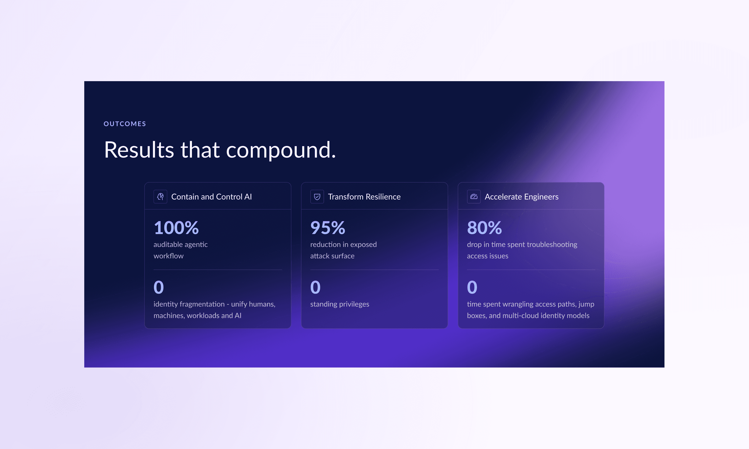
The development of this system reduced time from initial ticket to go-live by around 70%. Accessibility was also greatly improved.
Results
The development of this system reduced time from initial ticket to go-live by around 70%. Accessibility was also greatly improved.